 |
|
Fonts & Art
|
 |
|
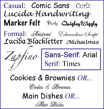
The typeface, or font, and artwork you choose for your cookbook can help you establish a theme or an attitude (playful or formal). If done well, no one should really even notice how perfectly your art and font blends into the cookbook. Done poorly, and people will look at the pages and not quite know what’s wrong, but see that it’s just “off” somehow. For instance, cartoonish illustrations for a formal black-tie wedding theme would be inappropriate. A formal font like Edwardian Script (below) would look out of place in a cookbook intended for a collection of children’s favorite recipes. Fonts
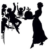
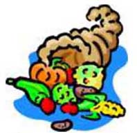
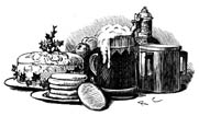
Above are some examples of casual and formal fonts. The kind of font you choose will help set the tone of your cookbook. Using a formal font for a cookbook with a wedding theme would look terrific, and a casual font would be appropriate for a family reunion – depending on your family. I used Lucida Handwriting for my accent font, and Arial for the body. Incidentally, in the graphic above, the names of the various fonts are all the same point size, 24. That’s another thing to consider: some fonts are remarkably different in size even when you select the same size for all of them. Art The art you choose should be from a similar family, or it will be distracting. The examples below are from three different sets, or families, of (royalty free) clip art.
Photos make a wonderful addition to a family cookbook, as well. Whether it’s a picture of a kitchen full of cooks, or a portrait of a family member, it’s another way to make your cookbook special. Imagine the pleasure of someone a generation from now, leafing through your heirloom, and finding a recipe from their great-great-grandmother, as well as her picture... priceless!
|


